Rewa is a Kolkata (Eastern India), based brand dedicated to upcycling floral waste. They reclaim flowers from religious institutions and surrounding water bodies to convert them into sustainable lifestyle products.
Floral waste is one of India’s major pollutants, affecting both land and water. Flowers used in religious rituals are considered holy and are not disposed of with regular waste. As a result, they are often discarded into the nearest water body, usually a river. Rewa addresses this issue while creating safe, purposeful products.
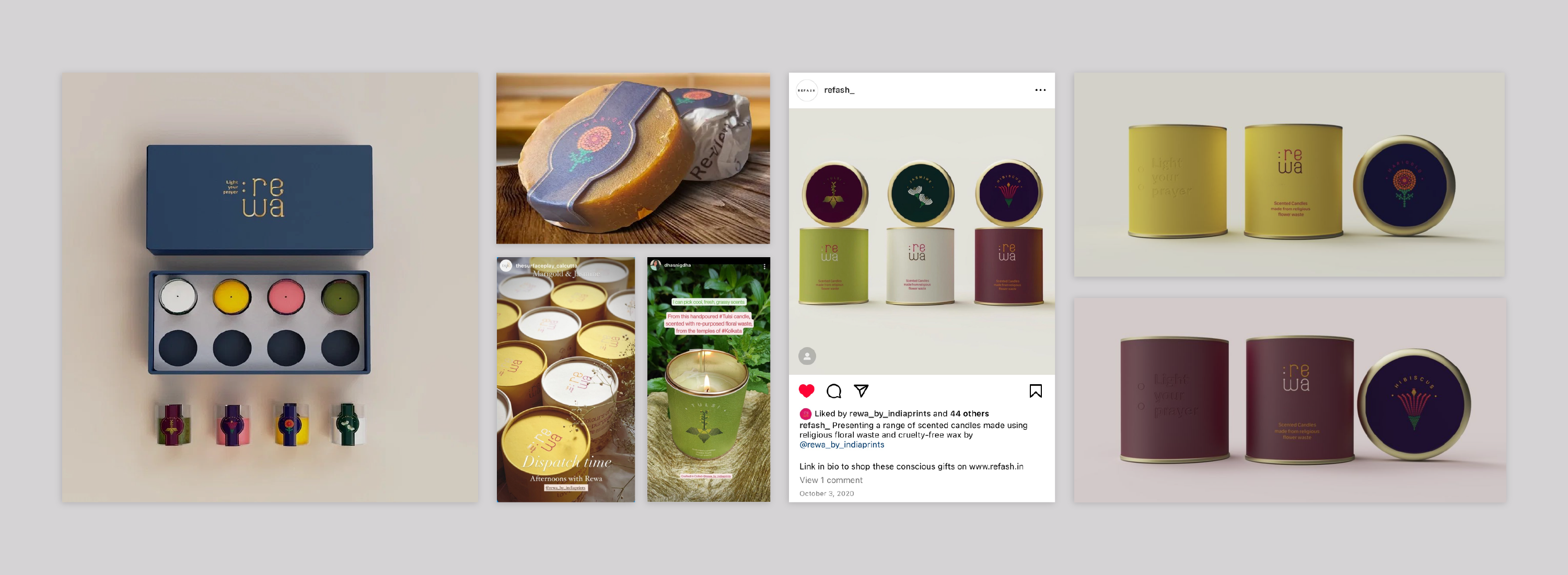
Rewa’s introductory range of products included cruelty-free wax candles, with plans to broaden their offerings to include soaps, compost and fabric dyes among others.
Brief
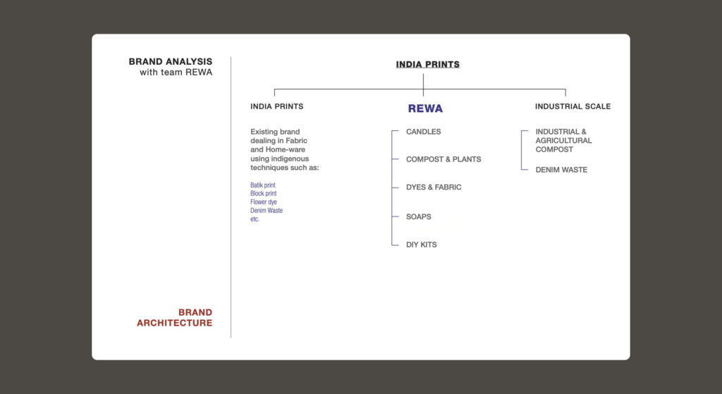
The organisation had already been operating as ‘India Prints’ which specialised in naturally dyed fabric. They now envisioned a more comprehensive brand for their lifestyle products, that would embrace a spectrum of activities derived from repurposing floral waste. Each product category within this brand needed to possess its distinct identity while remaining seamlessly integrated into the overarching brand narrative, characterised by cohesive branding elements, visual language, and packaging.
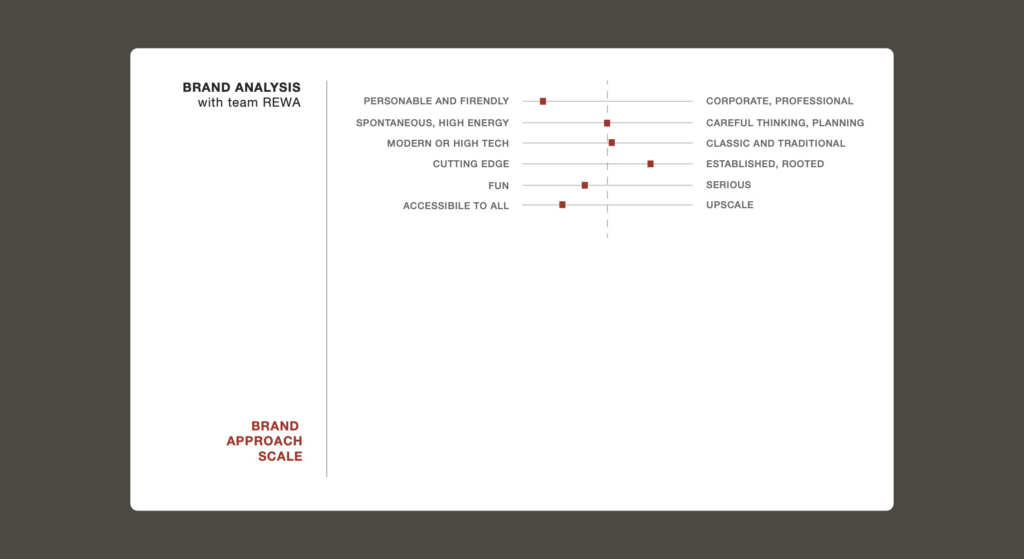
Pre-design workshop
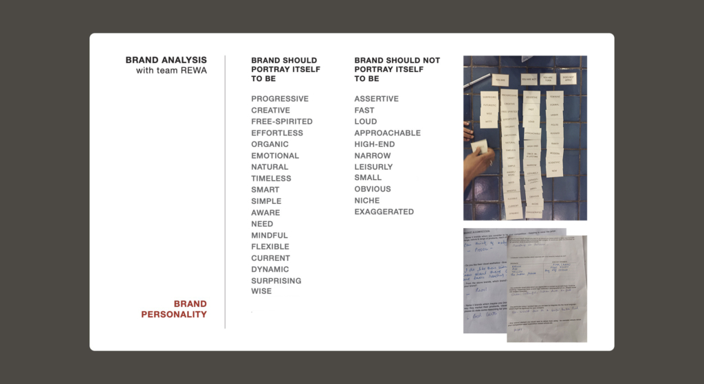
The design process kicked off with a brief workshop with Rewa’s founders. These collaborative sessions were instrumental in delving into the brand’s architecture, defining the ethos of the lifestyle product range, and articulating the project’s overarching objectives and expectations.
“Rewa believes every end has a new beginning. Rooted in faith and driven by conviction we’re taking a step towards a circular economy.”
Shaguna Agarwal, Co-founder
The workshop’s outcome provided invaluable insights into the brand’s core belief. Crafting the visual identity required a delicate balance, honouring the products’ origins — rooted in religious florals, devotion, and environmental impact — while infusing a spirit of freedom and contemporary relevance. Moreover, the brand sought to authentically convey the Indian essence of the concept while consciously avoiding allusions to specific faiths or stereotypical visual elements.
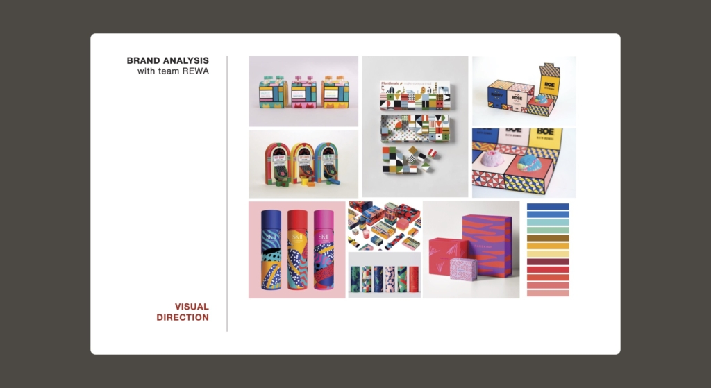
Visual exploration
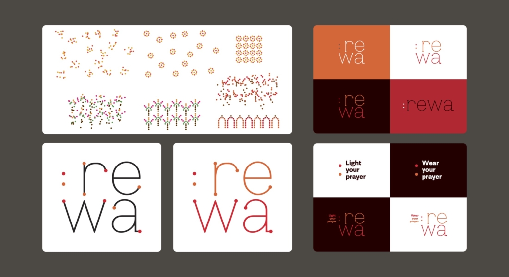

Brand identity
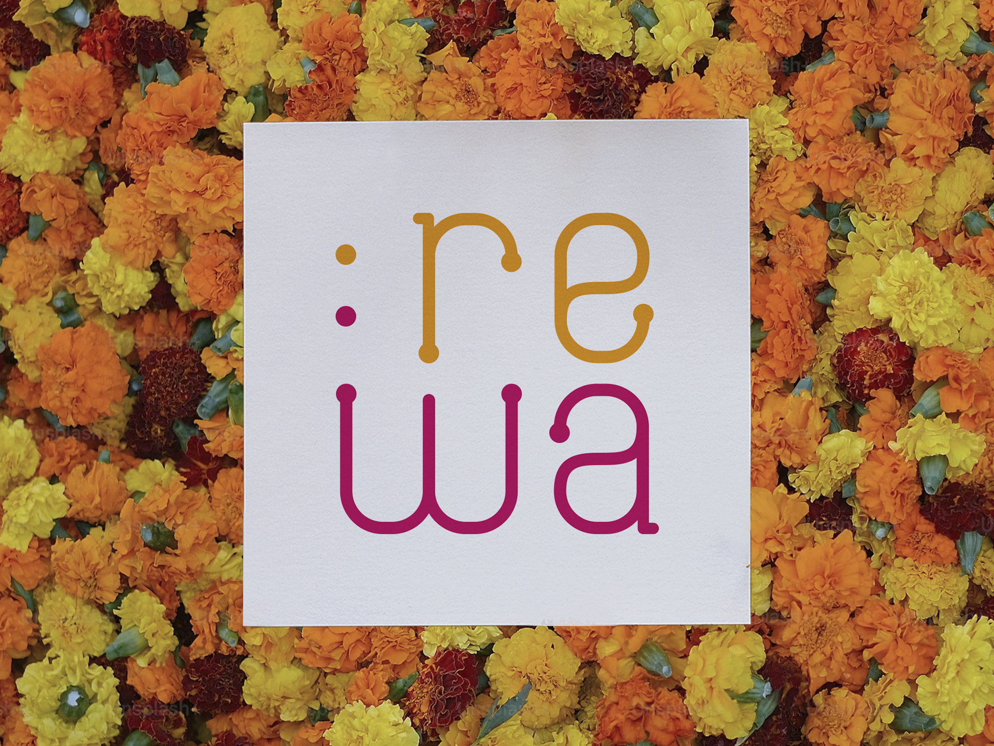
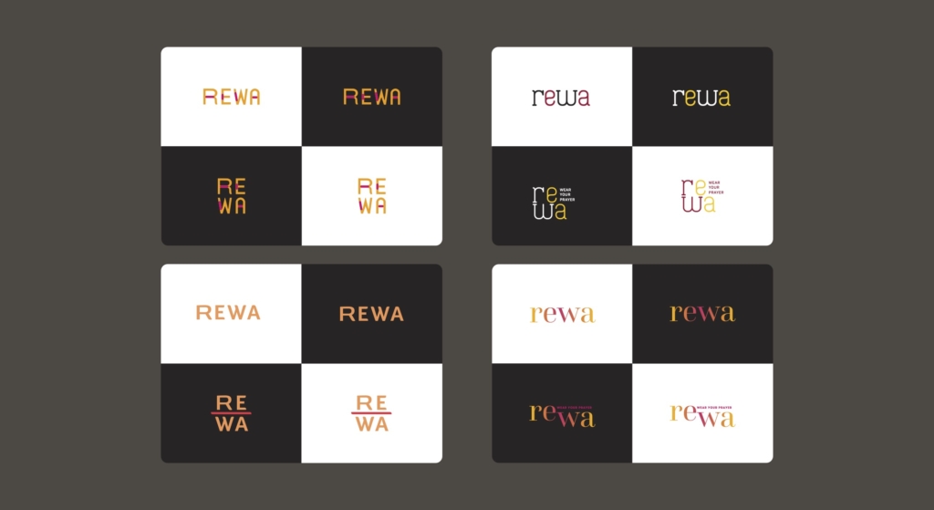
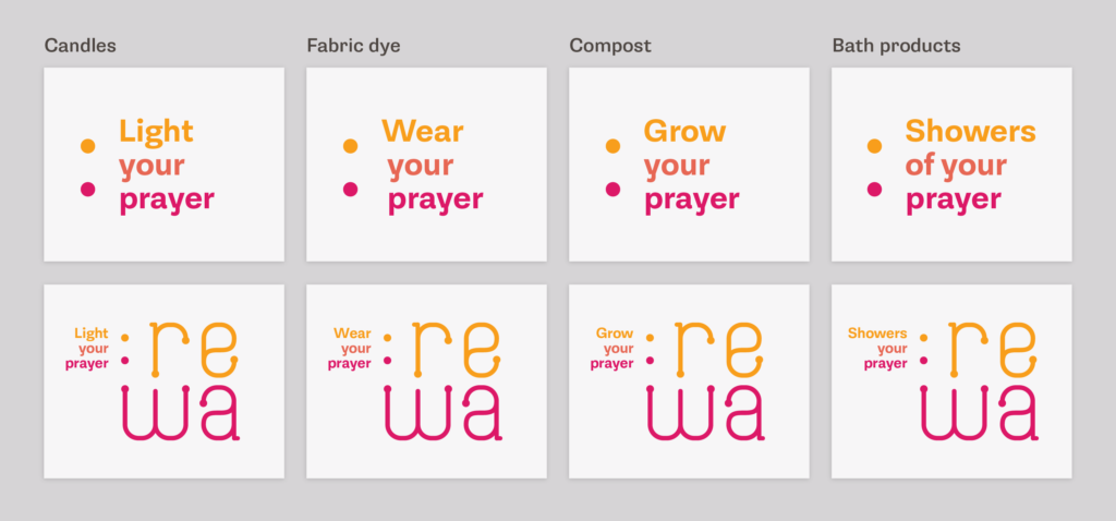
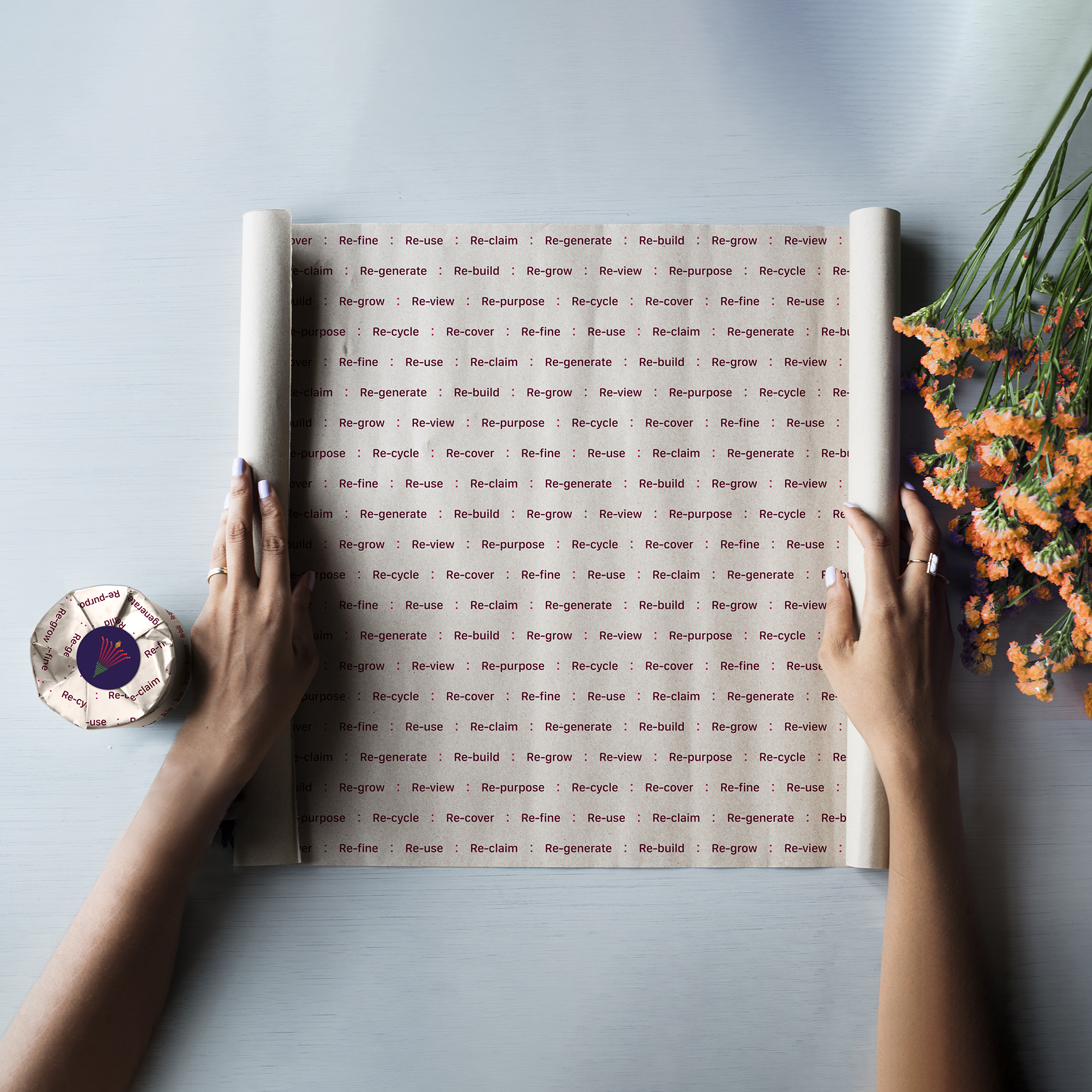
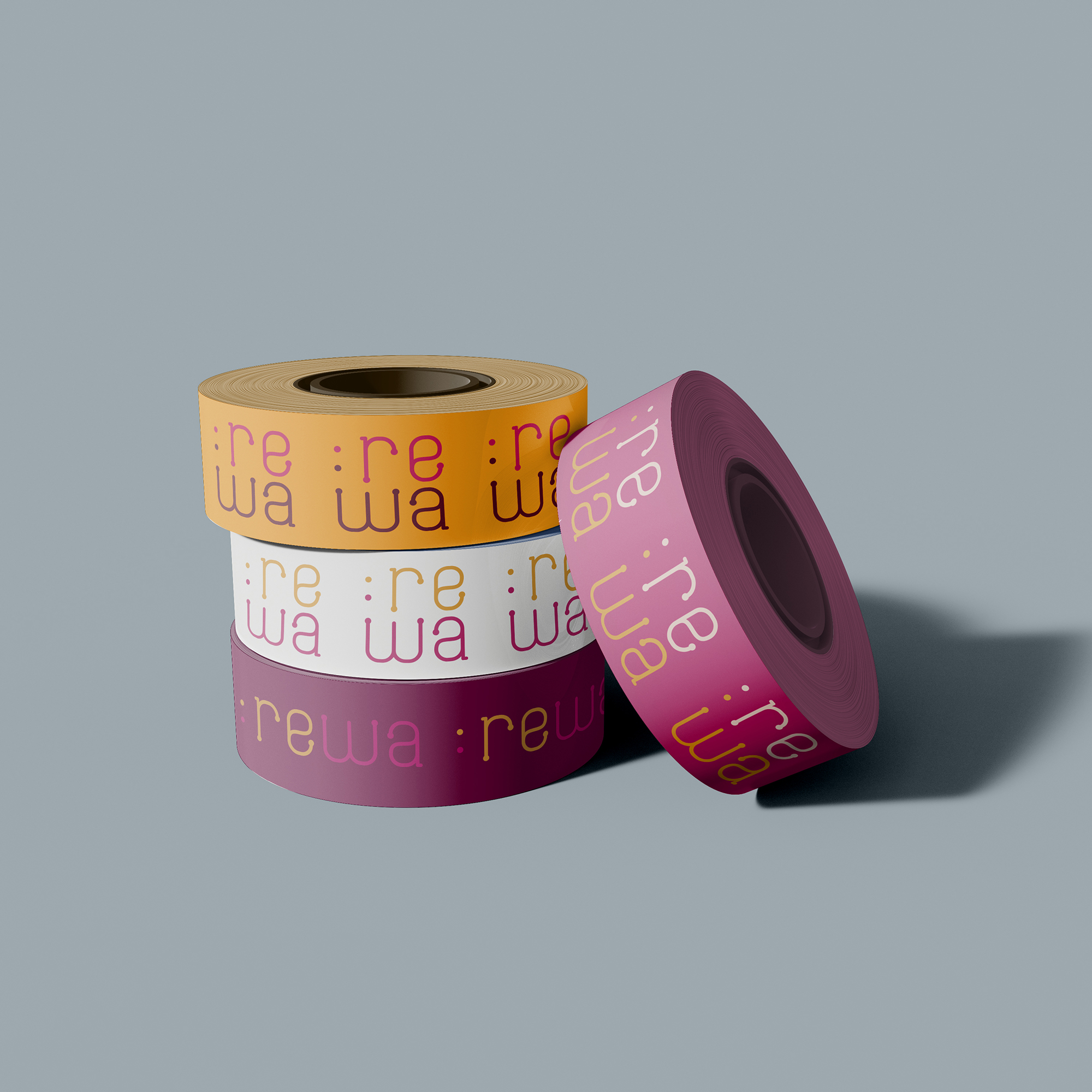
Rewa’s logo is a vibrant representation of the brand’s mission and ethos. At the heart of the brand identity is a ‘dot’, representing the start and end point for many processes within nature. This reflects the brand’s commitment to keeping the cycle of creation and regeneration alive through recycling and reusing.
The colon emerging from the dot serves as a historical symbol, introducing the logical consequence or effect of our actions. ‘REWA’ becomes the logical consequence of reclaiming and repurposing floral waste, bringing positive change to the environment and communities.
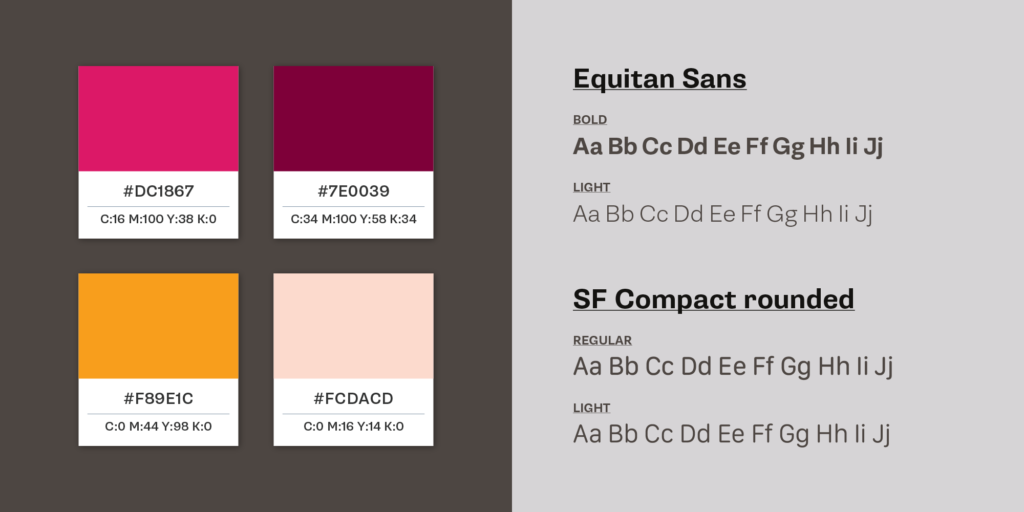
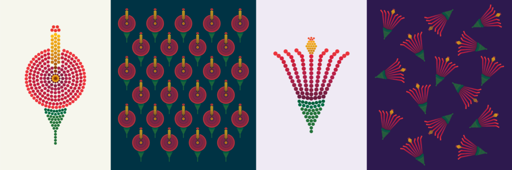
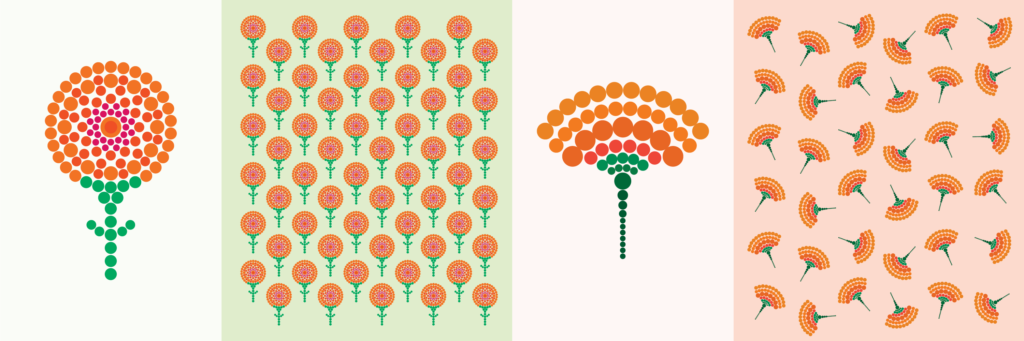
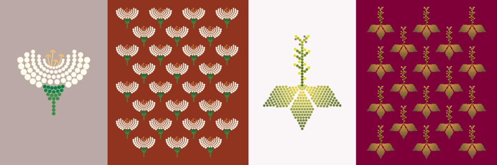
The colour palette for Rewa draws direct inspiration from the vibrant hues of Indian religious flowers.
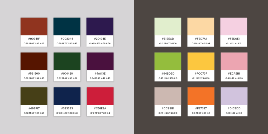
In addition to the primary palette, we developed a secondary palette, mostly comprising tints and shades of the primary colours, allowing for versatility across various brand touchpoints. This expanded palette enhances the visual language of Rewa, ensuring consistency and cohesion across all brand elements.
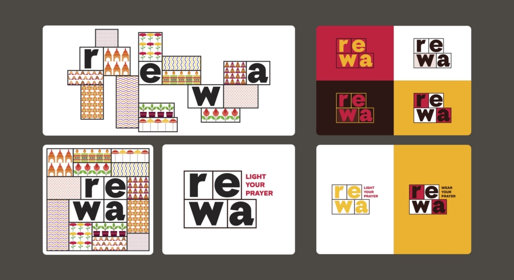
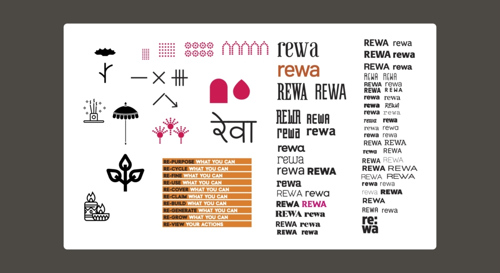
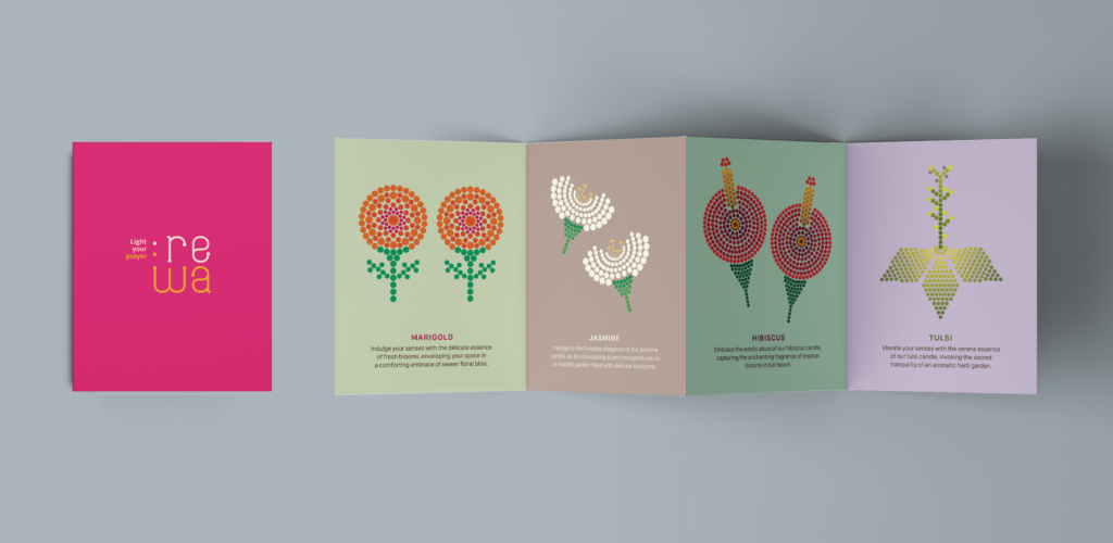
Extending Rewa’s Brand Identity: Floral Illustrations and Patterns
Floral illustrations and patterns were crafted to extend Rewa’s brand identity across multiple touch-points. Central to these designs was the the ‘dot’, aligning seamlessly with the brand’s overarching concept.
One of the key objectives outlined in the design brief was to enhance the individuality of Rewa’s product categories while maintaining coherence with the overall brand narrative.
To achieve this without overshadowing the primary brand identity during its initial stages, we opted for a unique approach: utilizing copy rather than visuals for differentiation. This strategy allowed us to keep the brand’s visual identity prominent while integrating the ‘category phrase’ creatively within each group’s touchpoints, much like hidden gems waiting to be discovered.
Packaging and print collaterals
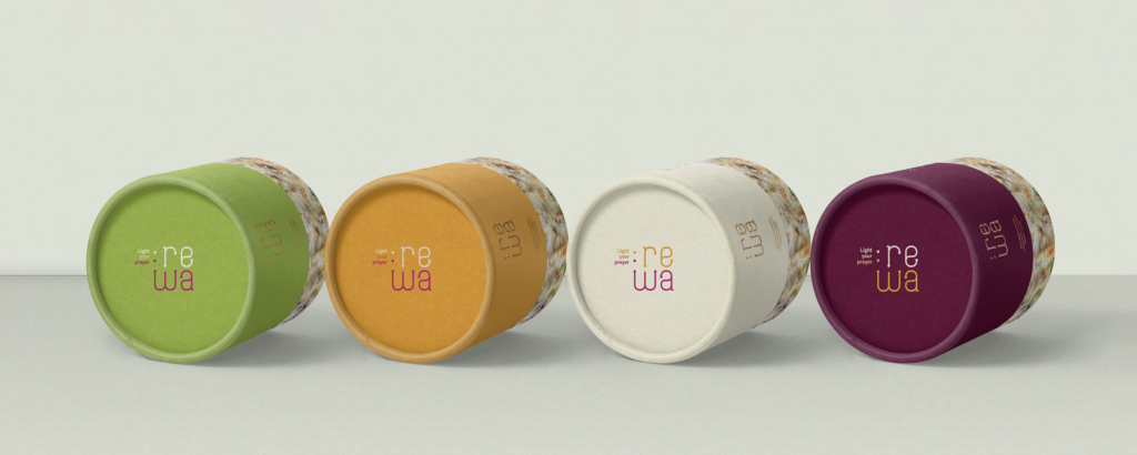
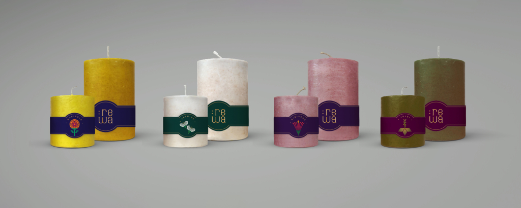
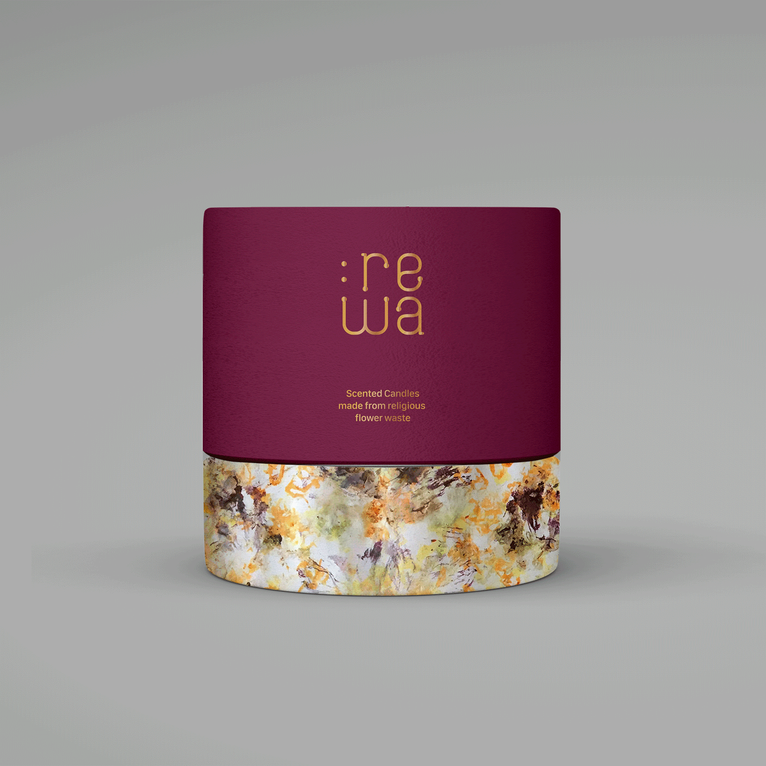
One of the primary touch-points for the brand was it’s packaging — essential for both online retail across diverse e-commerce platforms and physical presence in select stores and exhibitions. The process began with designing for their inaugural product line — candles available in four distinct fragrances across three sizes each.
Challenges:
- Crafting aspirational packaging suitable for mindful purchasing, gifting, and conveying the candles’ origin and impact without appearing preachy.
- Balancing the need for cost-effective printing while ensuring each candle fragrance is distinctly differentiated.
Solutions:
- Carefully chosen premium quality, pre-colored, recycled paper from Sona Papers to complement the fragrance hues.
- Handcrafted boxes with screen printing due to low initial order quantities. Consistent information was maintained on each box across all fragrances, adjusting only colours to harmonize with the base paper, thereby reducing printing costs.
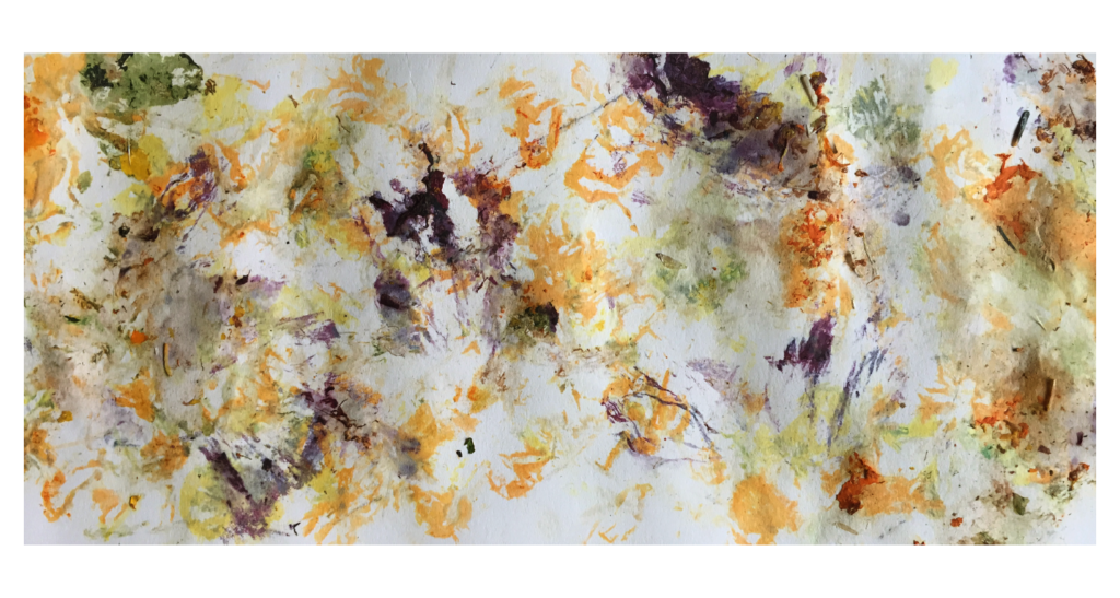
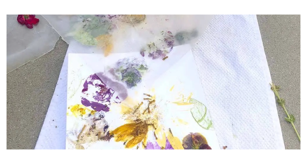
Flower pounded paper:
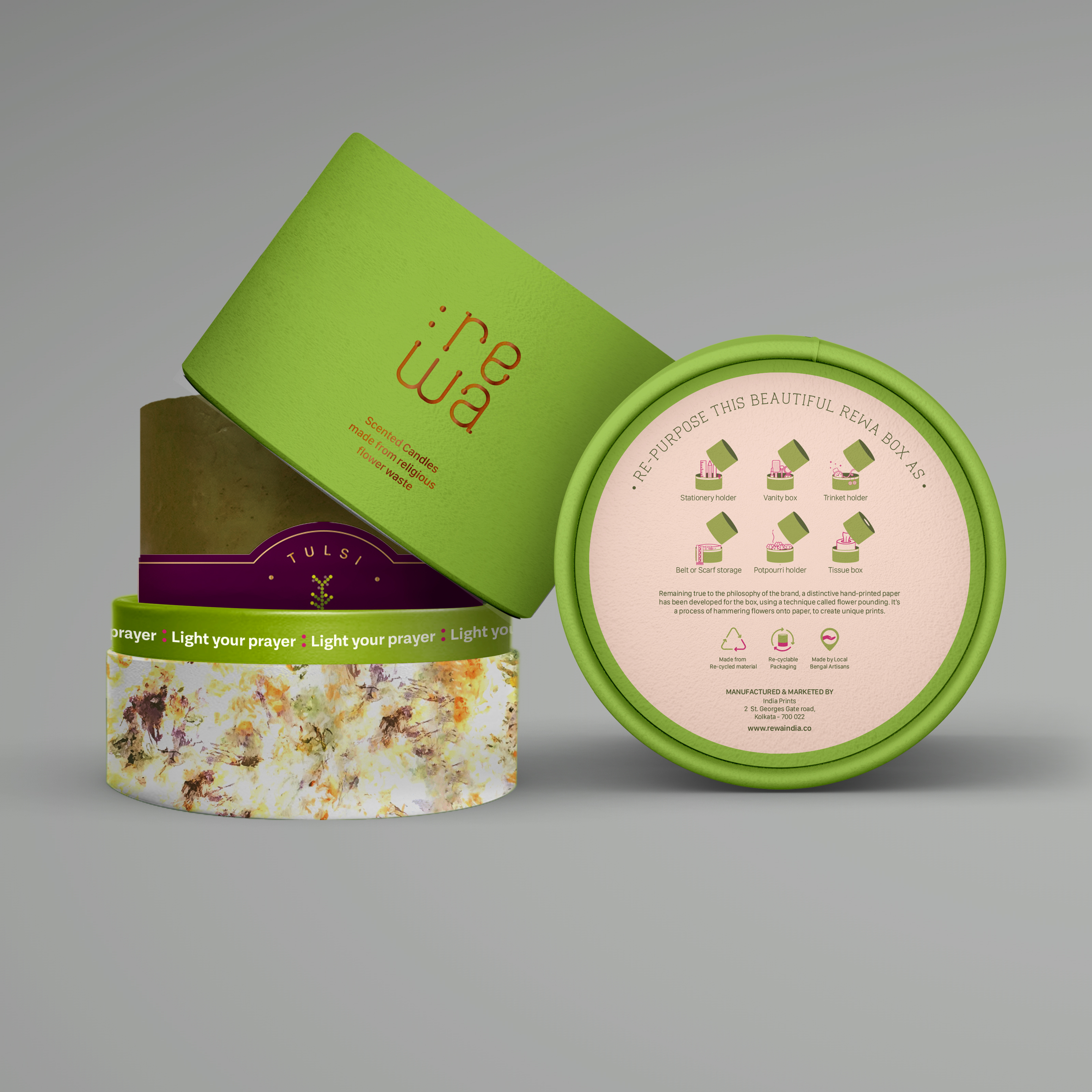
We decided to use flower-pounded paper — made from the same reclaimed flowers — for the base of the boxes. This choice not only made the packaging visually distinctive but also helped in making it self-explanatory, intriguing, premium, and impactful, without the need for overt messaging.
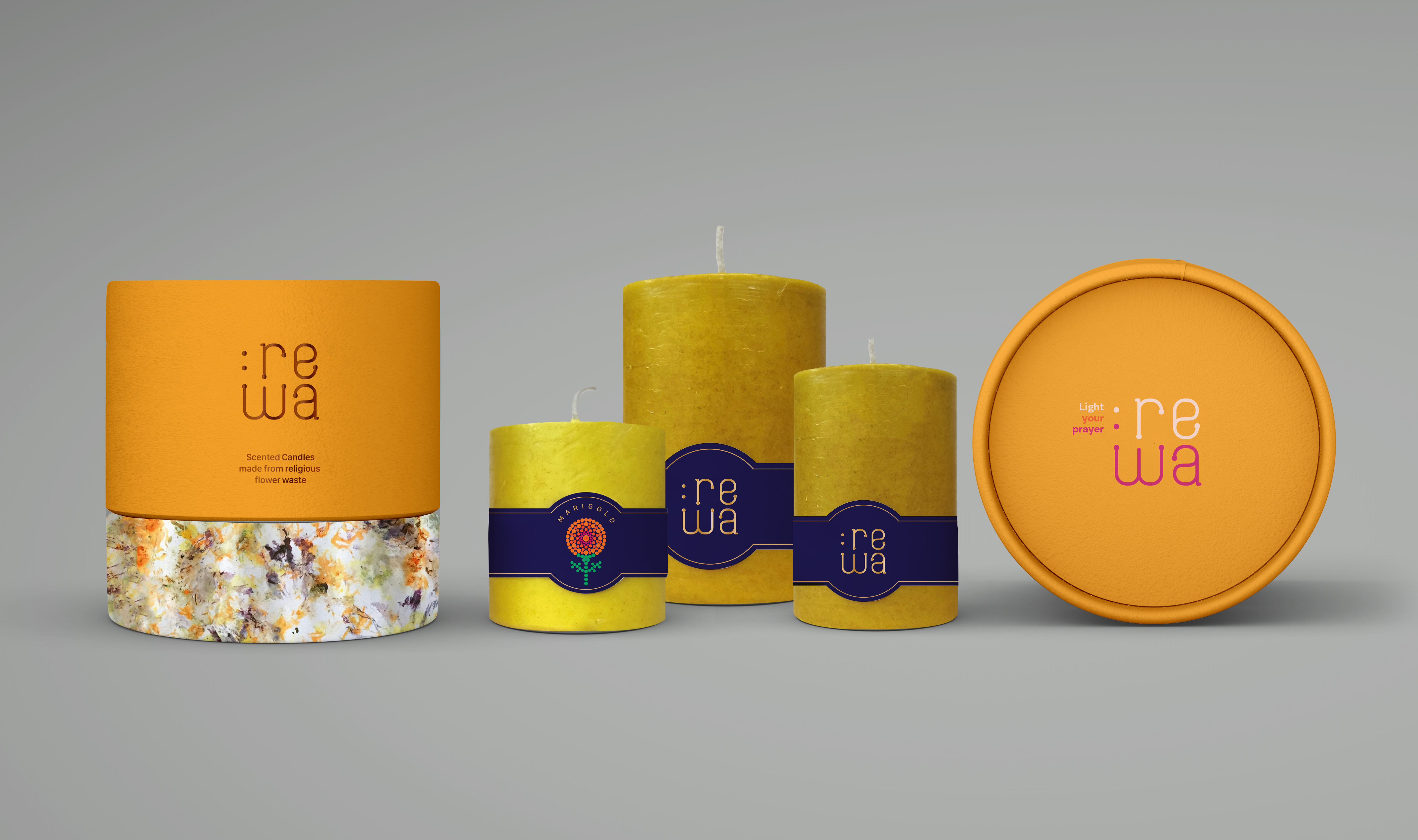
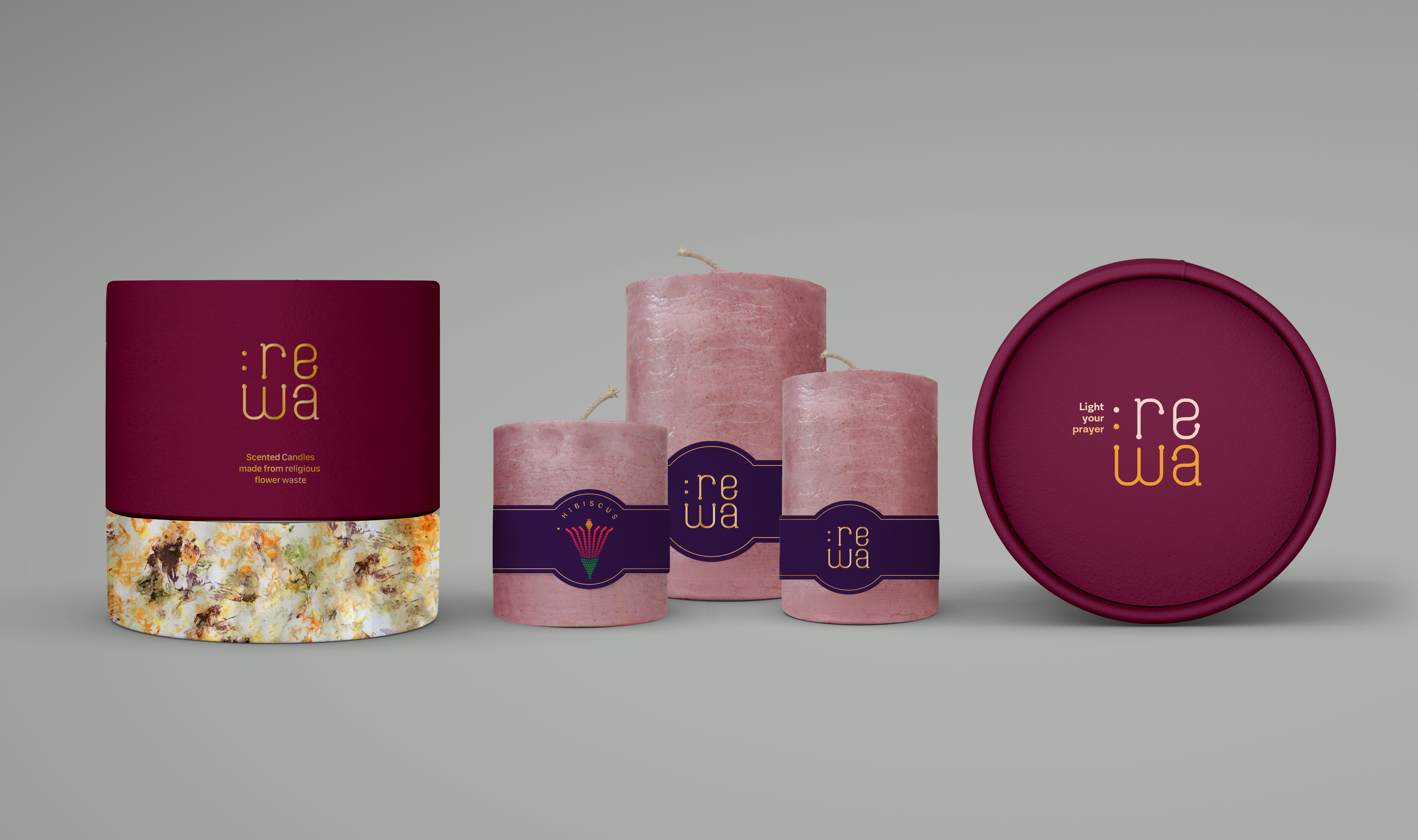
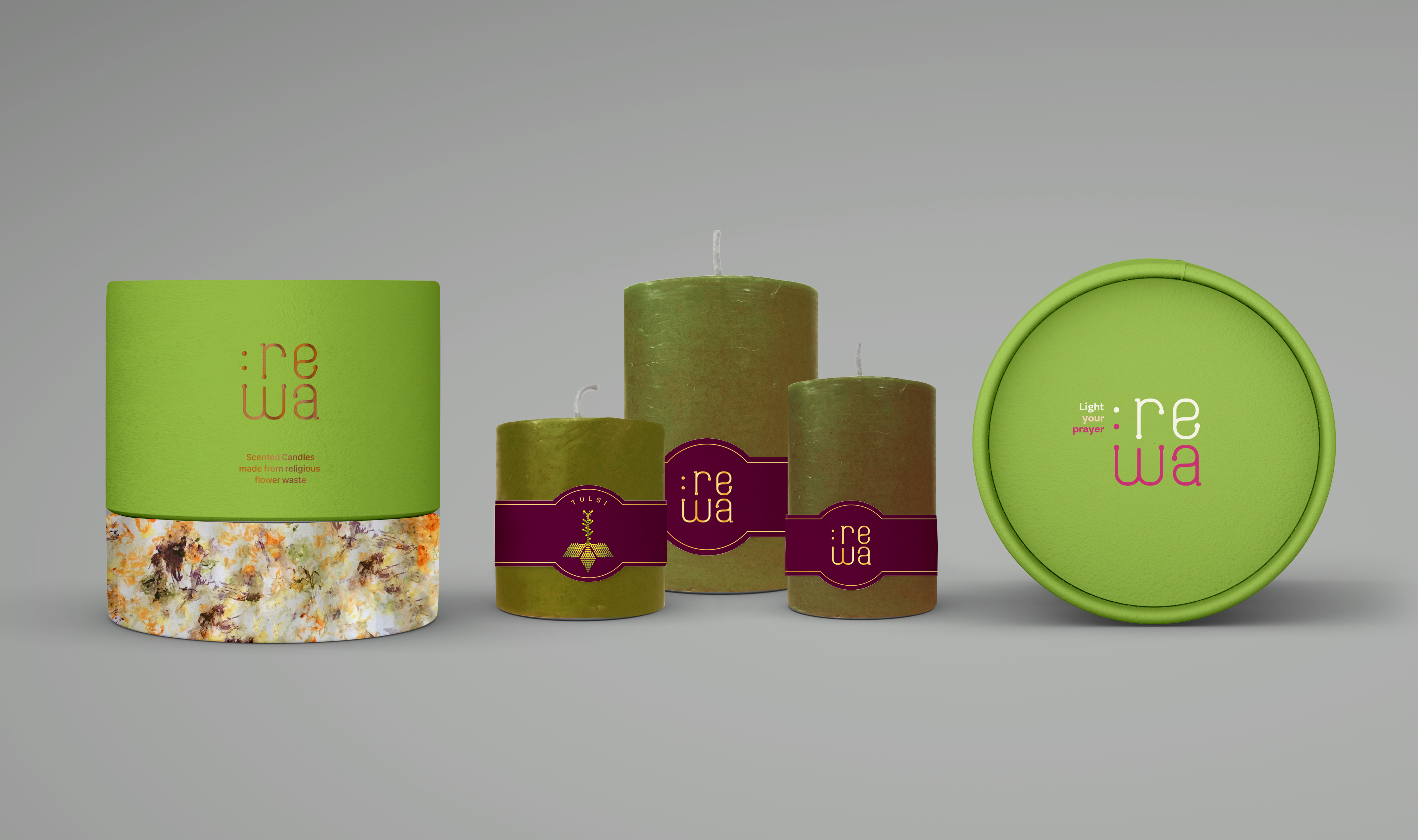
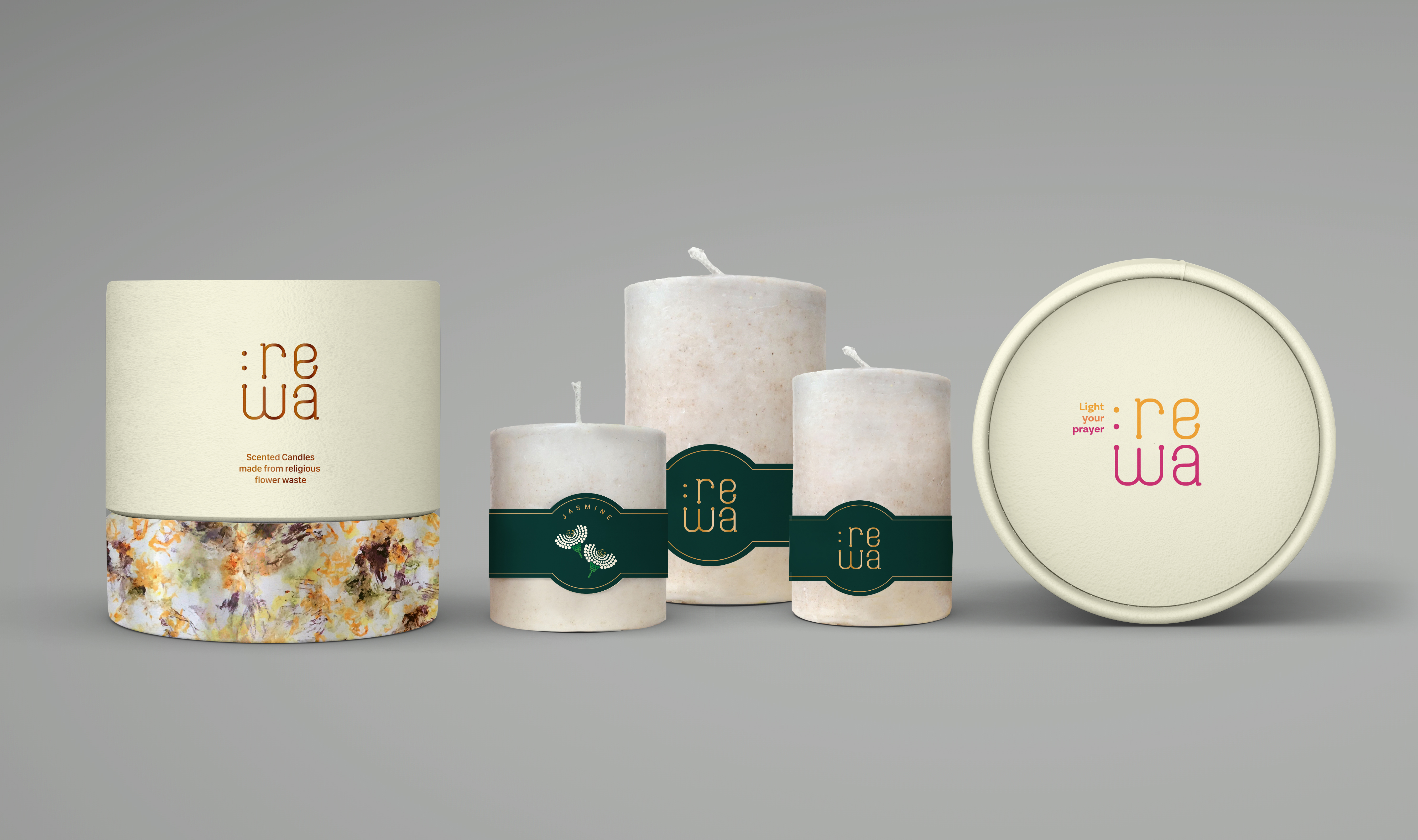
The information was kept minimal, to encourage reusability of the boxes. The base of the box, also included suggestions for repurposing the boxes.
We made use of the box rim to add the category phrase — in this case ‘light your prayer’ — for category differentiation and added user delight.
Future visual consistency
While our scope of work was limited to branding and packaging (for Rewa’s introductory candles), we aimed to empower Rewa’s internal team to extend and adapt the visual language across future products and categories. To achieve this, we conducted a concluding workshop to share our design process, guidelines, and pre-developed assets.
Over the following months, the team successfully utilised these components and assets to design packaging for additional products and categories, ensuring consistency with the established visual language and a stronger brand presence.